


The Best Call-to-Action (CTA) Button Text: Insights from an A/B Test Case Study
In digital marketing, the most minor changes can lead to significant results. One such area where subtle tweaks can make a substantial impact is the Call-to-Action (CTA) button.
At Wisevu, we have conducted numerous CTA A/B tests to uncover the most effective strategies for maximizing conversion rates. Through our extensive experience in web design and meticulous research, we have gained valuable insights into the impact of CTA button text on user engagement.
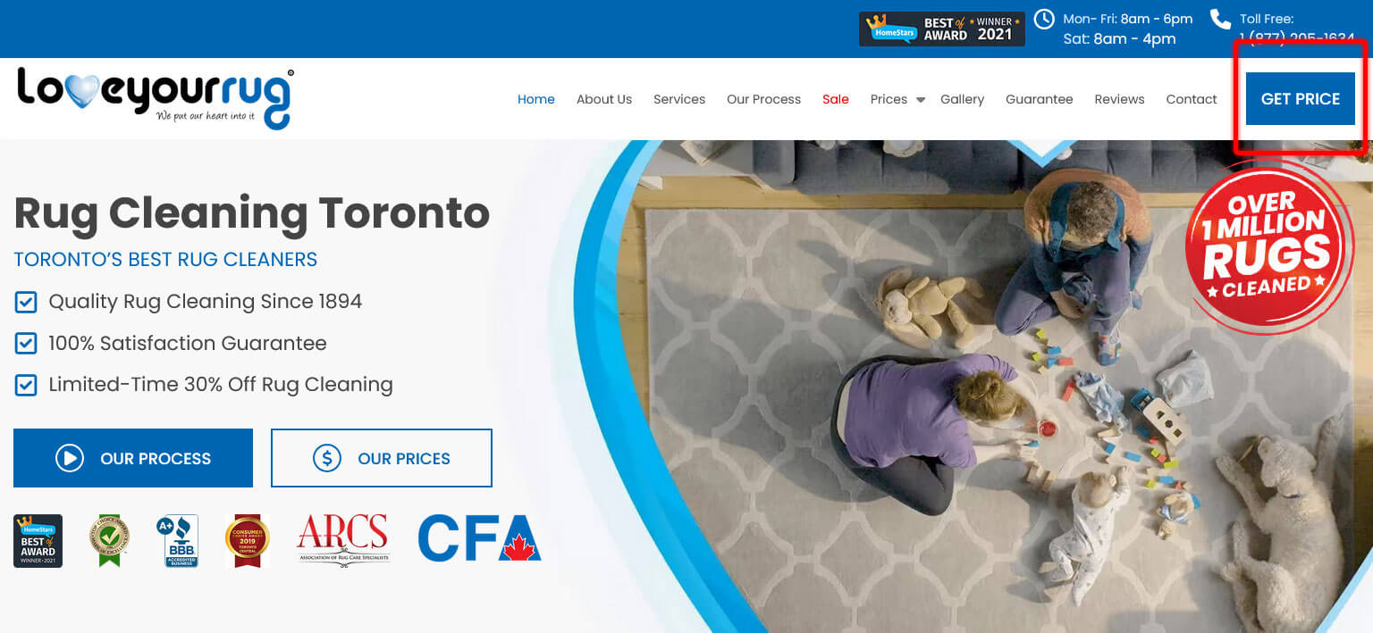
In this particular case study, we examine an in-depth A/B test performed for one of our esteemed clients, a leading provider of rug cleaning services in Toronto.
Importance of CTA Buttons
CTA buttons are critical elements of any website because they guide users toward desired actions. The right wording can significantly change how users interact with a page, directly influencing conversion rates.
Strong CTAs are clear, concise, and action-oriented. They speak directly to the user’s benefit and create a sense of urgency. For instance, instead of a generic “Submit,” a CTA might be “Download Your Free Ebook Today!” These buttons focus on what the user gains and use strong verbs to encourage immediate action.
The A/B CTA Experiment: Identifying the Most Effective CTA Button Text
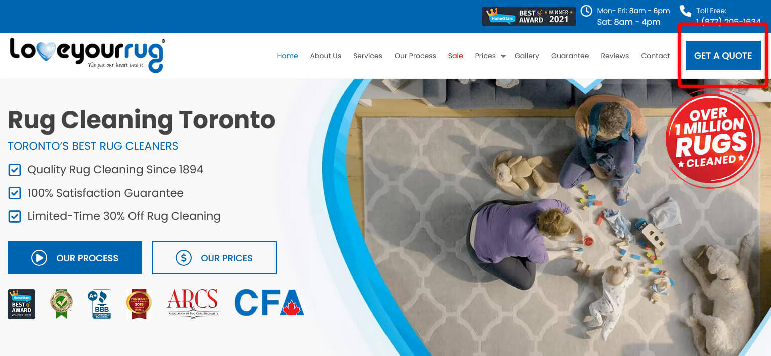
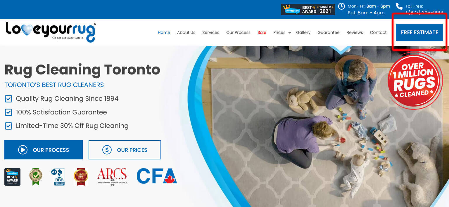
Our experiment aimed to determine the best call-to-action button text that would generate the highest click-through rate (CTR). The client’s website featured a prominent CTA button in the main navigation menu, and we hypothesized that different wording could influence user behaviour. We tested four text variations over six months from July 24th, 2020, to February 1st, 2021.
The CTA texts we tested were:
-

- Get a Quote
-
- Free Estimate
-
- Free Quote

-
- Get Price
Methodology
We utilized Google Optimize to set up and run the A/B tests. This tool allowed us to simultaneously display different CTA texts to different segments of visitors. To ensure the accuracy and reliability of our results, we used Google Analytics to track and measure the click-through rates for each variation.
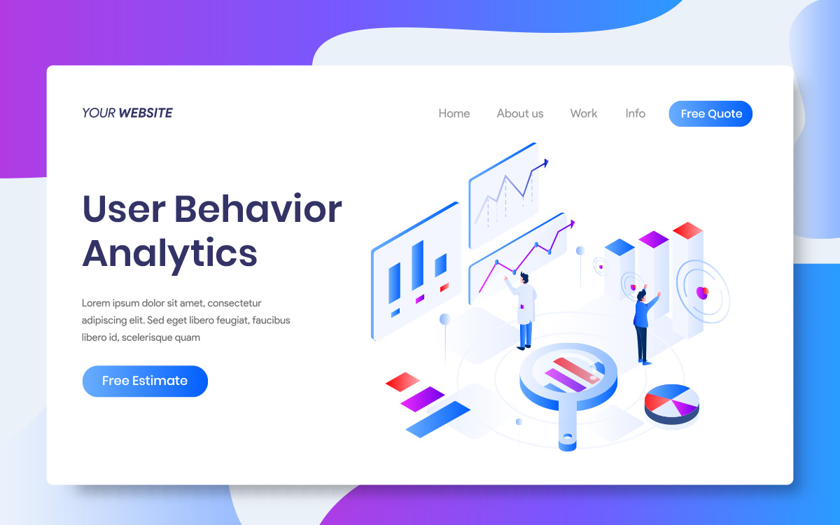
Results: Insights from User Behavior Analysis
Our A/B test was conducted over two quarters to ensure we gathered sufficient data. The average Click-Through Rates (CTR) for each CTA variation over this period were as follows:
- GET A QUOTE – 2.06%
- FREE ESTIMATE – 2.10%
- FREE QUOTE – 2.31%
- GET PRICE – 2.12%
The results indicate that the term ‘FREE QUOTE’ most effectively captures users’ attention, consistently outperforming other variations.
Why Did “FREE QUOTE” Win?
A few possible explanations exist for “FREE QUOTE” emerging as the best call-to-action button text. First, “Free” is likely a magnet for cost-conscious clients. They might be looking for a no-obligation price estimate, and “Free” clearly communicates that.

This aligns with an insight from Dan Ariely, who discovered a strong human tendency to be drawn to free things, even if the value is minimal.1 We might dislike missing out on potential benefits and enjoy the ease of acquiring something for nothing.
Second, “Quote” might hold a slight edge over “Price” or “Estimate” in terms of perception. It can be more professional and detailed, influencing how users see the offer. This resonates with the experience of a finance solutions company that saw a huge increase in click-through rate when they switched their CTA from “Get a Demo” to “Free Demo.”2
This reinforces the idea that focusing on providing valuable information at no cost can significantly boost user interest and lead to more actions.
Optimizing for Conversions with Data-Driven Insights
While identifying the winning CTA text was a significant victory, our mission extended beyond simply increasing clicks. A high click-through rate is fantastic, but the ultimate goal is to convert those clicks into paying customers.
Here’s how we approached the next stage of optimization:
1. Landing Page Analysis
With “Free Quote” driving more visitors to the quote request page, we dived deeper into the user experience. Our meticulous analysis focused on optimizing elements that directly influence conversion rates:
- Clarity and Focus: The page’s purpose should be clear – requesting a quote for rug cleaning services.
- Form Simplicity: The quote request form must be concise and effortless. Minimize the number of required fields and consider offering pre-filled options where applicable (e.g., zip code).
- Value Proposition: Briefly highlight the benefits of using your service. What sets you apart from the competition regarding quality, expertise, or customer service?
- Trust Signals: Incorporate trust signals like customer testimonials, certifications, and secure payment guarantees to instill confidence in potential customers.
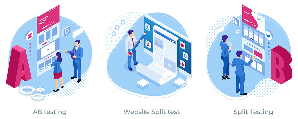
2. Continuous A/B Testing
The beauty of A/B testing lies in its iterative nature. We continued testing different landing page elements, such as headlines, form fields, and value proposition messaging. This ongoing process allowed us to refine the user experience further and boost conversion rates.
3. Tracking and Measurement
Throughout the optimization process, we meticulously tracked key metrics like quote requests, conversion rates, and bounce rates (visitors leaving the page without requesting a quote). This data provided invaluable insights into user behaviour and allowed us to measure the effectiveness of our changes.
Key Takeaways From Our Experiment
This six-month A/B testing project exemplifies the power of data-driven digital marketing. By meticulously testing different CTA button texts and optimizing the landing page, we significantly improved the user journey and lead generation for our client.
Here are some key takeaways for businesses considering A/B testing:
- Develop a Hypothesis: Don’t go in blind. Formulate a hypothesis about what might work best based on your understanding of your target audience and industry best practices.
- Test Multiple Variations: The more variations you test, the more insights you’ll gain. Don’t limit yourself to just two options.
- Focus on Statistical Significance: Don’t jump to conclusions based on small fluctuations in data. Ensure your results are statistically significant before implementing changes.
- A/B Testing is a Continuous Journey: It’s an ongoing discovery process. Keep testing, refining, and optimizing to maximize your website’s effectiveness.
By embracing A/B testing and a data-driven approach, businesses of all sizes can unlock the secrets to higher conversion rates and a thriving online presence.
Let Us Help You
At Wisevu, we are committed to helping our clients achieve the best possible results through data-driven approaches and continuous improvements. Let our expertise in optimizing conversion rates drive your business success.
Contact us today to see how we can improve your conversion rates. Learn more: Conversion Rate Optimization!
References
- Ariely, Dan. Predictably Irrational, Revised and Expanded Edition: The Hidden Forces That Shape Our Decisions. 2010, www.amazon.com/Predictably-Irrational-Revised-Expanded-Decisions/dp/0061353248.
- Birkett, Alex. “When ‘Free’ Converts (and When It Doesn’t).” cxl.com, 20 Oct. 2015, cxl.com/blog/when-free-converts-and-when-it-doesnt/.